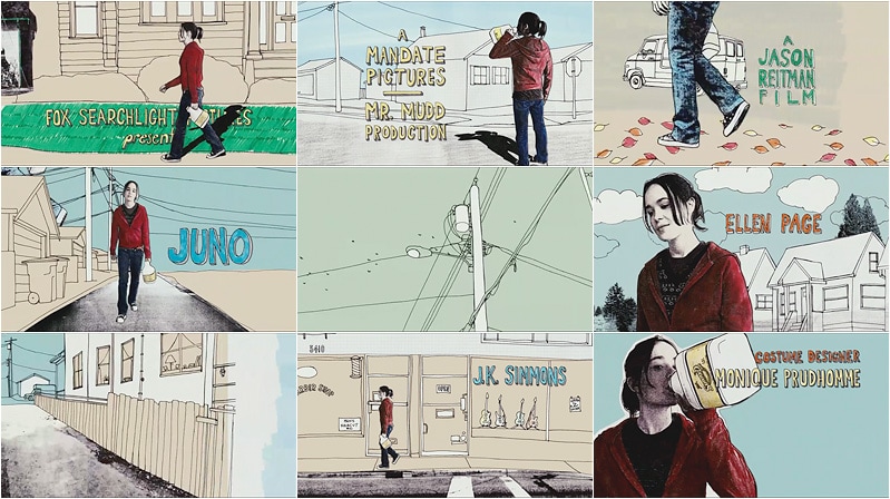
Juno (2007)
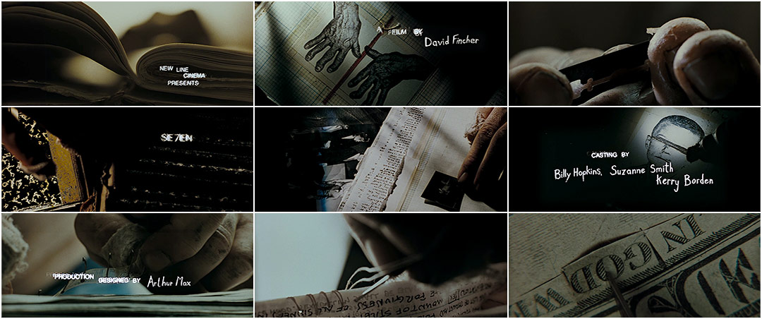
Se7en (1995)
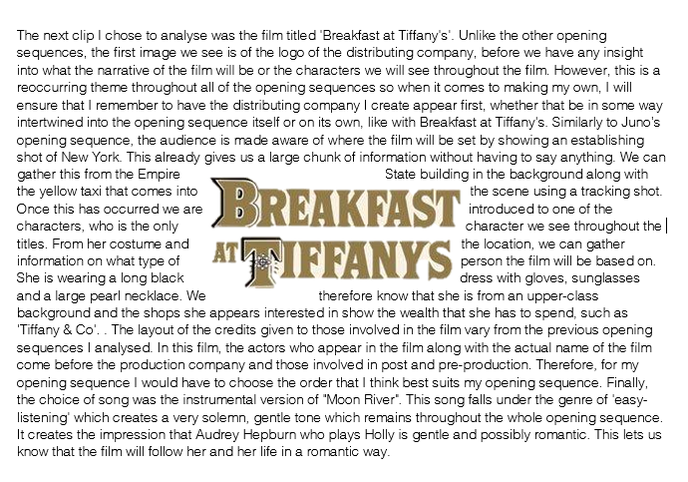
Breakfast at Tiffany's (1961)
Genre - Mystery/Crime
For my actual opening sequence to be made with fellow students Reece Savva and Theo Smith, we decided to make a opening sequence focusing on the genre of mystery and crime. Therefore, for my in depth analysis, I made the decision to go with opening sequences that linked to that genre in order to collate and assimilate ideas that I could use in my opening sequence. It makes me aware of how opening sequences in this genre are laid out in regards to the order of production and distributing companies as well as the type of music used to create the sinister tone that is normally associated with mystery films. I will also take in the choice of text type, along with the amount of narrative given that will relate to the rest of the film.
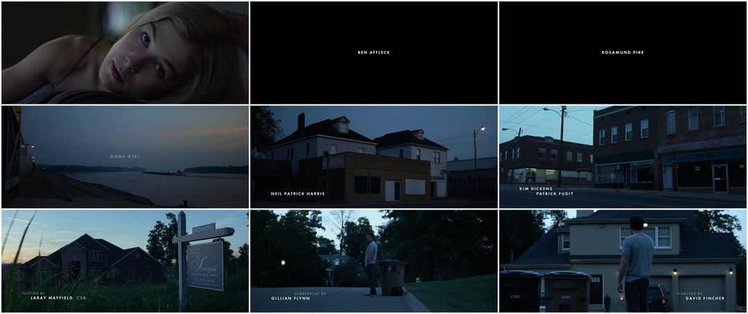
Gone Girl (2014)
Insomnia (2002)
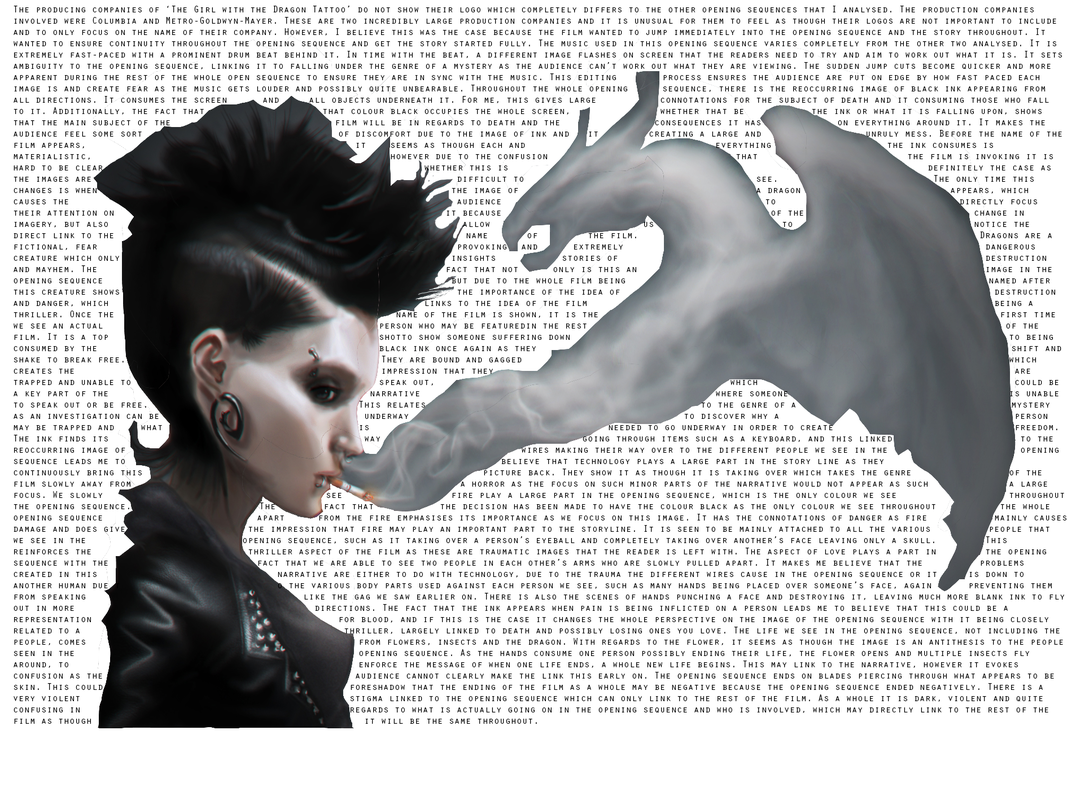
Girl with the Dragon Tattoo (2011)
Production Companies and their logos
Production companies can choose whether or not they decide to include both the logo and name of their company in the opening sequence, or just the name of their company. The bigger production companies, such as Columbia, Paramount and Metro Goldwyn Mayer.
Columbia
|
Columbia productions began their journey as CBC so had this logo that would be in relation to that. This logo was used throughout the time of 1919 to 1924. It was only a serious of words, so they had the most dramatic change out of all the changes regarding the logo. They created a female Roman solider carrying a sword and a shield. However, this transformed in 1928 into the ‘Torch Lady’. This was a woman holding up a torch, dressed in cloth and with a headdress. This more related to the logo that we witness today, with the set of stairs she stands herself upon, he more animated, life like lady with Columbia’s name behind.
|
|
|
|
UniversalUniversal was founded in 1914, and began it’s life in regards to logos with what appears to be the planet Saturn, as it had a ring with the Sans Serif font used to write ‘The Trans-Atlantic Film Co Ltd”. However, in 1923, Universal decided to pull itself into having the logo appear more like Earth by losing the ring and using smoke from a plane that circles Earth. Today, the company moved from model work to CGI to film around the Earth and then to go ahead and zoom out, where the word Universal appears. This was only recently changed in 2012 in order to celebrate the 100 years that the company had been in business.
|
Metro-Goldwyn-Metro
|
MGM originated with Loew’s incorporated purchasing Metro Pictures Corporation and also Goldwyn pictures. When creating the logo, it was discovered that Loewe was German for lion so that encouraged the reasoning behind having a lion as the centre point of their logo. From 1916 to today, the logo hasn’t changed an awfully large amount. It was created by Howard Dietz, featured Slats the lion in the centre piece and had the Latin for “art for art’s sake” place around the lion’s centre piece. In 1958, the lion in the centre piece was changed and they proceeded to add his roar in the background. In 1932, the company released the coloured version of the logo. In 1966 and 8, the company featured a completely new style of logo into two of their films. It had a blue background with an animated drawing of a lion along with the letters ‘MGM’ This was deemed very unpopular by the audience so was quickly changed. From 1957, the most common logo has not changed dramatically, however there have been many subtle changes to the overall product in order to keep in modernised for films produced today.
|
|
Our Own Production Logo
|
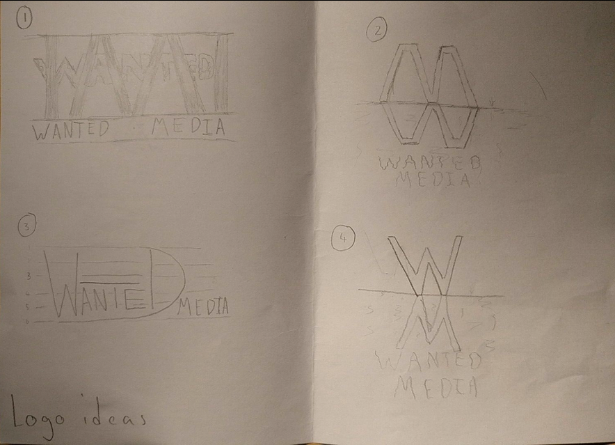
Our group decided to name our production company 'Wanted Media'. This links to our mystery genre of our opening sequence and would make more sense to the audience and more understanding of what our opening sequence is about. Reece Savva came up with 4 logo ideas for our production company. The first one, the one most likely to be used because of the tally results (see below) has the idea of the name wanted being being behind bars that spell out the letter 'M' for media. The jail bars link the logo to crime and our opening sequence being a crime mystery. The animation we want for our logo is the wanted logo appearing after a flash of light similarly to a light bulb. Afterwards, the bars will move in to create the 'M' along with the 'Wanted Media' appearing along the bottom.
|
|
|
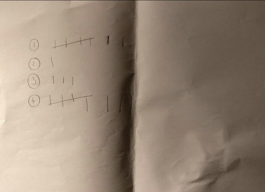
Here we can see the tally results that went with our logo designs. Reece went around a year 13 class in order to gain results on what our target audience would like to see the most. There was a steady tie between logo 1 and 4 and as a group we discussed that we preferred logo number 1 which is what we decided to go with.
|
The involvement of light came from both Columbia and Universal Studios using glare. We changed this around with light flashing in the background. Having the writing appear clearly comes from most production logos such as Metro Goldwyn Metro, Universal and Columbia, all making it exquisitely clear of what our company is called for the audience.
First Cut of our Ident
This was our first Ident made using HitFilm 4 Express, by putting commands in to make the bars move as well as having the opacity of the words 'wanted' and 'wanted media'. However, after receiving feedback, we believed that to improve it we would need to add music as well as changing the font on the 'wanted' in the centre. This would make it look more professional.
Final Cut of our Ident
Here is the final product for our production logo. We decided to add a small sting in order to make it seem complete and professional. Additionally, the 'wanted' sign in the middle had the font changed in order to make it seem more mature and set the correct tone and first impression for the audience.
Titles
Target Audience
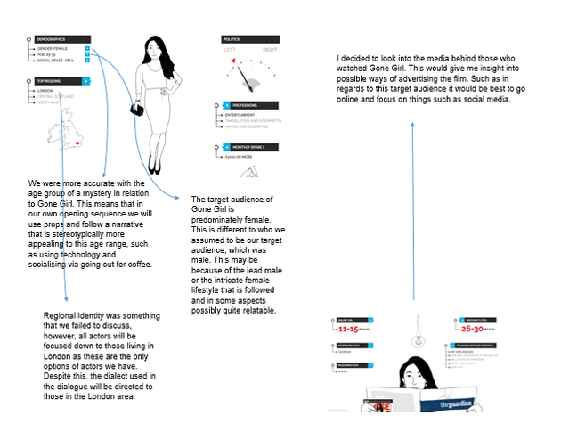
I first analysed the YouGov profile for those who watched the film that I analysed, 'Gone Girl'.
The next YouGov profile I looked at was those interested in the film 'the Girl with the Dragon Tattoo' which I analysed as one of my opening sequences.
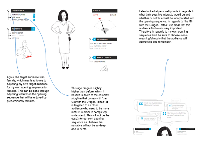
In regards to taking this information into consideration when producing my own opening sequence may not be as likely as expected. This is because the reliability of this information will not be very high. Therefore if I produce my own opening sequence based primarily on this information, it may not be to the highest standard, or target the right audience. However, one main thing I do need to consider is that my own target audience will be female, not male. This is because the type of mystery film I am producing will be much slower-paced with a thought out narrative, which is stereotypically more appealing to women, instead of a high intensity action film. Therefore, when producing an opening sequence for a predominately female audience, I will have to bring in the use of things such as props and costumes that stereotypically will hold the interest of women. To make the information gathered from YouGov more reliable and to be able to start getting down to the finer details of my opening sequence, Theo, Reece and I decided to make a survey on surveymonkey to ask those around us their likes and dislikes of mystery movies to know what to include in our own opening sequence that will appeal to a larger audience. We also began thinking about marketing so asked a question on the platforms that people view films and how they find out about films in order to hypothetically target the largest audience in the best way.

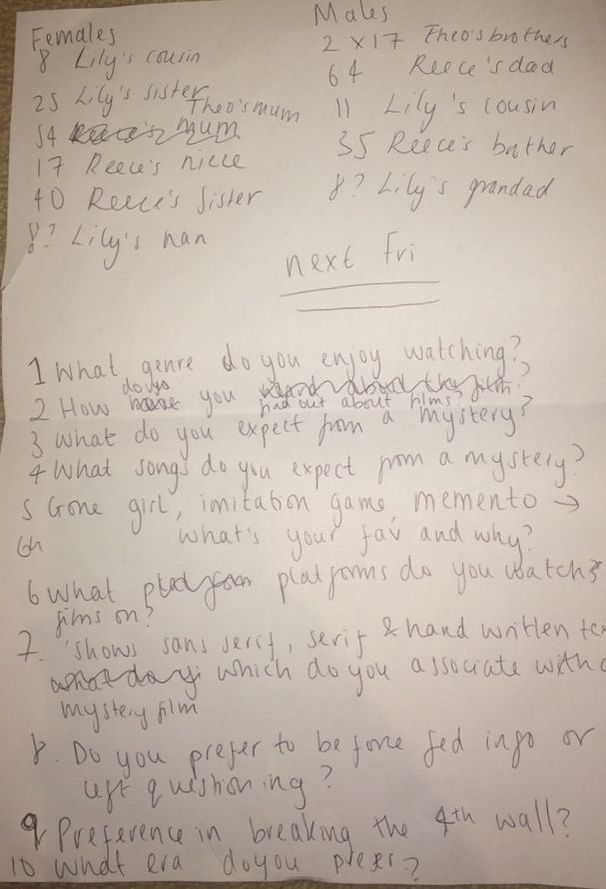
Here is a copy of our original ideas for survey questions. We were originally going to do spoken interviews for our research, however, we discovered that this would take us a large amount of time and we wouldn't be able to gather the information and analyse it in time so therefore we decided to fill out a 'surveymonkey' and send it to family and friends.

Marketing
Time, 00:00-00:55, introduction of speakers and what the podcast is about.
Time, 00:56-03:35, discussion about inspirations, talking about the idea of focusing on character building and character journey, rather than an overall mystery.
Time, 03:36-06:05, talk based on answers from questionnaire, brief discussion about red herrings and the fact that we are going to avoid the use of these as these are more related to trailers of films, more talk about inspirations and aspirations for film.
Time, 06:06-07:19, some talk regarding target audience and what we should focus on to please our target audience, this can be seen on other blog posts up above.
Time, 07:20-09:44, start to talk about our ideas for start of film, discussion about flash backs or ‘flash forwards’ and mention of Marvels Netflix series ‘Jessica Jones’ as inspiration for style of flash back
Time, 09:45-14:15, lots of talk about main character, who his is, what’s his background, how do we introduce him
Time, 14:16-17:15, talk of location and different shot types, slight plot development
Time, 17:16-21:30, a lot of discussion about structure and plot of opening scene, including shot types, reasons for decisions
Pitch
Feedback
When displaying this Pitch to one of my media teachers, we got both positive feedback and feedback on how we need to improve. We mentioned the name of our production company but did not go into any detail about the ident and logo. We then had to later explain the fact we had done the sketches and tally so knew what our logo was going to look like but was yet to produce it. There was also the fact that we didn't have the exact equipment budget on the pitch and hadn't yet confirmed our cafe scene as we hadn't got filming permission from the cafe. We had to ensure we limited our editing softwares down to one in order to ensure that editing went as smoothly as possible. However, the fact that our pitch actually looked like a newspaper to link to our overall opening sequence worked well. There was also the fact that we had equally spread out the different parts of the pitch to focus on. The music choices and production schedule were extremely well thought out with things like days to reshoot factored in. Also, wardrobe and makeup and casting had greats amount of detail so that each participant in our group and our media teacher could completely understand.
Location Proposals
Script
| media_studies_script_draft.docx |
This is the first draft of our script. After doing a read through located beneath, we made some edits to the opening of the script and any spelling mistakes made. This is discussed here.
| media_studies_script_second_draft.docx |
We then made the final draft of our script with the added edits that we made in our podcast featured above. This included a whole new starting scene as two group members Reece and I believed that is what would be essential to our opening sequence. We also fixed any issues with grammar and syntax. We went on to noticed that it had no dialogue, so went on to create a shooting script instead. This featured all of the time stamps of shots along with the music behind it because those are the features that we need to focus on when not featuring dialogue.
| shooting_script_draft.docx |
Here we see our shooting script. It has a total of 22 shots. Our group has ensured to remember that we may not stick exactly to our shooting script as we may feel on the day that this it is not the route we want to go down but it is good to have a starting point which we can work off of and improve. Both the directors script and the shooting script was presented by Theo Smith.
Storyboard
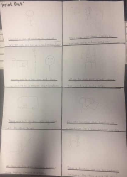
Here is the first drawn out image of our storyboard. We completed this after creating the script as we mainly discussed the idea of the different shots in our podcast. Therefore the storyboard was trying to simply bring it to life. We then went on to create an animated storyboard on storyboard.that as this will make our drawing appear much easier to understand. I believe what is wrong with our storyboard is the fact it is much too small, with a short amount of shots. In order to ensure our film is to the best of its ability, we went along with creating our shooting script in order to show the shots in more detail so we know exactly what we are doing.
Here is our animated storyboard created on 'storyboardthat'. It was made using storyboard that, where the animations can be dragged and dropped into the scene. The problems faced with using this website was the fact that we couldn't show all the shots in the scene as the only angles we got create were wide shots. This meant that any close ups or over-the-shoulder shots, for example, had to be in some way replicated or not at all. This meant that the storyboard would be good for viewing the overall scene but not each individual shot, which is what the shooting script will be relied on. In the pitch this was presented by myself.
Equipment Budget
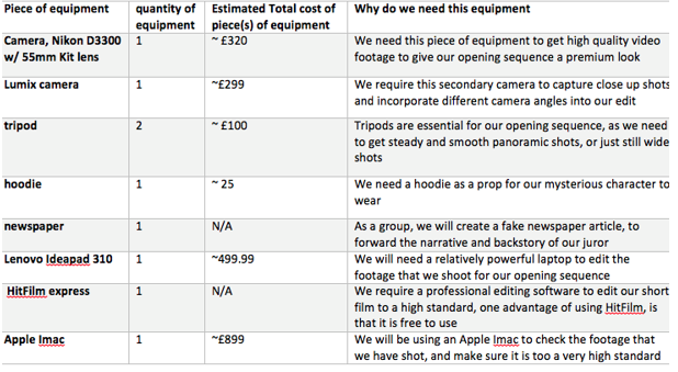
Here is a copy of our equipment budget that was featured on our pitch. The total of all the equipment used in our opening sequence came to around £2,142.99. This would not be an issue for us as all of the equipment we are planning on using will be provided for us previously. We wanted to get an idea of the scale that this production would reach, so the way we did this was through the budget. In our pitch this was presented by Reece Savva.
Production schedule
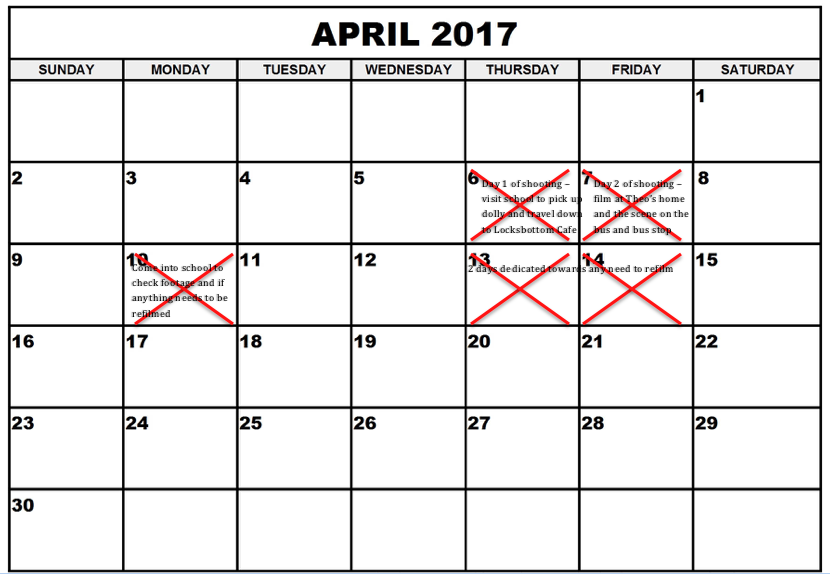
This was the copy of our production schedule. it was difficult to see what was written underneath each of the crosses when presenting our pitch, so therefore I had to discuss this with the audience. The 6th and the 7th would be the first two days dedicated to filming. The days would last from 9 until 5 so that we could have a good 8 hours of filming. Also we chose the 6th as our first day because it gave enough time for two of our team members to be fully recovered from a trip to New York as well as the fact that the school would be open on the 6th which meant that we could come in to to collect any equipment such as a dolly. We marked off the 10th because this was another day that our school was open. This meant that we could come in on the 10th to go through our footage on the schools computers. We then finally marked off the 13th and the 14th in order to have two days dedicated to refilming if we needed it/
Casting
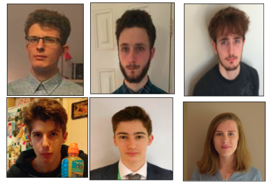
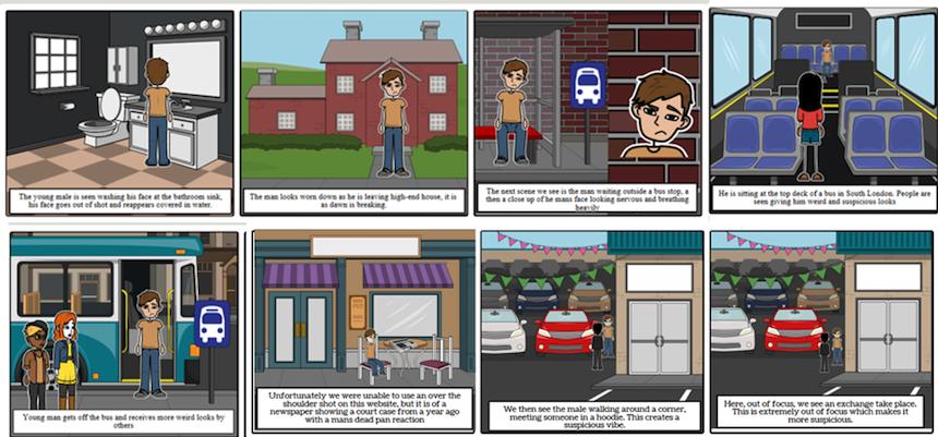
Here we have 6 images of the cast featured in our opening sequence. This was presented by Reece Savva in our pitch. He spoke about the fact that Theo Smith, top left would be casted as the criminal in our scene. You may not be able to see the hooded figures face so you may not be able to see him. Underneath him is Sean Savva, who will be playing the juror in our opening sequence. This is the main character in the sequence and who will be seen the most through the opening sequence. The rest of the cast pictured above will be seen as extras who will be on the bus or by the bus stop, giving the main character weird shifty looks.
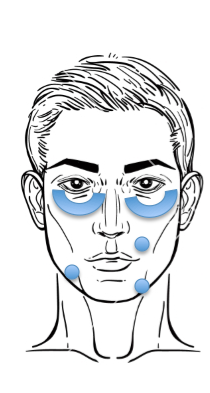
Wardrobe and Make-up
|
Here we have a picture of the makeup that will be featured in the opening sequence. Here we have possible placement of where the concealer may be placed if we need to create a blank canvas for filming.
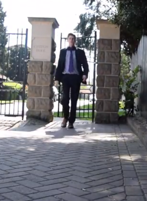
Here is an image of the costume that our juror will be wearing during the opening sequence. This will be a suit jacket with matching trousers along with a white shirt, tie and socks. This makes him appear very business like and as though he has done well.
|
Editing softwares
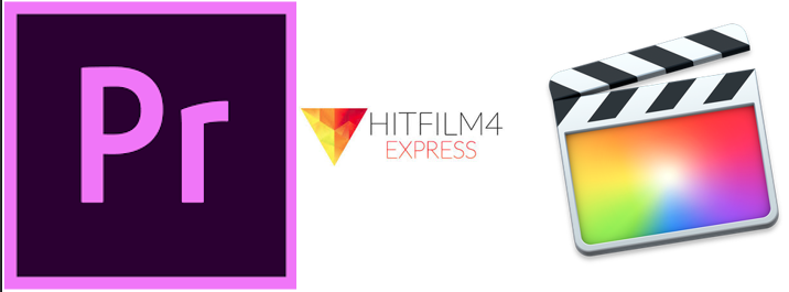
The three editing softwares used will be Adobe Premiere Pro, Hitfilm 4 express and Final Cut Pro X. The reason we have listed more than one is because of the different softwares that each members computer has. In school on the 10th we will use the schools iMacs which have Adobe Premiere Pro already previously installed on them. This is where we will check the footage in order to find out if we need to re-film. In regards to actually editing the opening sequence as a whole, we haven't decided on who's laptop this will be done on so therefore we listed both editing softwares for a Dell and a Macbook. After consideration and discussion, all editing will be done on AdobePremierePro. This is because, as mentioned earlier, this is the editing software used on the school software. It is the one each member of our group have used the most in regards to different editing tasks. Additionally, it is what all our media department teachers are most knowledge on also, so if we do face any problems when editing we have help nearby. The use of this editing software will be much faster overall. The school's computers will be able to handle the large amounts of clips, along with adding different types of special effects. This means that we would be able to finish our opening sequence much faster.
Music Choices
|
|
|
|
Copyright
New York
Evaluation Day 1
Evaluation of Day 2
Evaluation of Day 2
Rough Cut - 1st Draft
The first cut and export we made of the film was simply putting the film together to make sure that all the clips worked narratively wise, in case of the need for reshoots. This also was for the need to check for any shots that had not worked and would need to be reshot. This applied to the shot at 1.23, where the shot cut the top of Sean's head off, which made it look unprofessional. Additionally, the cut of me walking past the bus stop is not continuous. This is because in one cut my hands were in my pockets whereas in the next shot they were out of my pockets. The most noticeable thing about my rough cut was the fact that there was no music or titles. This meant that it did not look like an opening sequence at all.
Rough Cut - 2nd Cut
The next cut we did was including titles and music. This was to make the opening sequence feel more realistic. However, again after receiving feedback we discovered that the font used did not fit in with the tone of the opening sequence. We believed that it looked immature compared to the the micro-aspects and narrative seen in the opening sequence. Additionally, at this point in the editing process our logo was not completely finished so we needed to ensure this was added once it was done. It rounds off the opening sequence.
